What I took out of the Relation Circle patterns, is a way of laying out a network of information that correlates with each other in a circular aspect. Each piece of information is equally spaced around the circle and gives a clear indication of the relationship each part has with one another. Something that may help in the creation of this type of graph is to categorize your information by color coding different portions.
Videos on Visualizing Relationships
Weather Chart visualization
Bubble charts look very similar to scatter plots, but are created in a way that enables the designer to use more information. Bubble charts help the user understand differences and similarities by using data that is placed upon an x and y axis. When developing these graphs, the bubbles can be manipulated through size, color, or contrast so that the user is able to group specific information and understand things quickly.
Google Developer Bubble Chart
Interesting ways of creating bubble charts
Monday, November 26, 2012
Wednesday, November 21, 2012
P3 Project Statement
Background:
With the increase of knowledge of technology, our music devices are continually becoming more advanced. In 2013, Neil Young will be releasing his high resolution music device, Pono. Pono is the next generation of music players that will play songs with the same studio quality as they were created. As an advertising opportunity, and an introduction to the website a timeline will show music players dated back to the phonograph and will end with the Pono device.
Target Audiences:
The demographic will be music listeners who are more interested in hearing the music for the beauty of the songs sound engineering rather than just simply listening. They are people who may currently use Ipods. The age will range between 15 and 60.
Obstacles:
An obstacle that I may encounter is the lack of current information that has been released about this music player. Finding accurate information may be difficult, since this device is still kept behind doors.
Support Statements:
This will be a representation of where the future lies. Viewers will be able to see the next best thing in music. This will also be a way to release this device, in an interactive way.
Tone:
Historical, futuristic.
Media:
This will be released on the Pono website, and will be an introduction to the device.
Creative Considerations:
This will be a fun piece, and will enable me to give this product an entire style guide.
Tuesday, November 20, 2012
Unit 7 Reading
This week, we explored different information design mediums. After reading this chapter, I am able to identify each field of information graphic design. Interactivity is essential for our generation, with the increase of technology, interactivity is becoming a second nature to us. That is why reading this chapter is so important. Whether you are a graphic designer, web designer, or even an industrial designer, user interface is key to the success of any design. Having a good understanding of information architecture will be helpful for an interactive designer. Especially those specializing in web design. The navigation of websites will either make or break a site, so knowing logistics behind this important aspect of a website will allow the designer to create a successful user interface.
Ways to engage Interactive Infographics
Good Infographics
Ways to engage Interactive Infographics
Good Infographics
Friday, November 16, 2012
Project 3 Ideas
Finally, I believe I came to a conclusion of what I will create for our final project. I want to make a music player timeline, that I will illustrate rather than use photographs of music players over the years. This may be an ad for Apple if possible, because the final player will be an Ipod. The only creative consideration I may have to face is their advertisement style guides.
History Of Music Players
Music player imagery
Timeline Inspiration
More Imagery
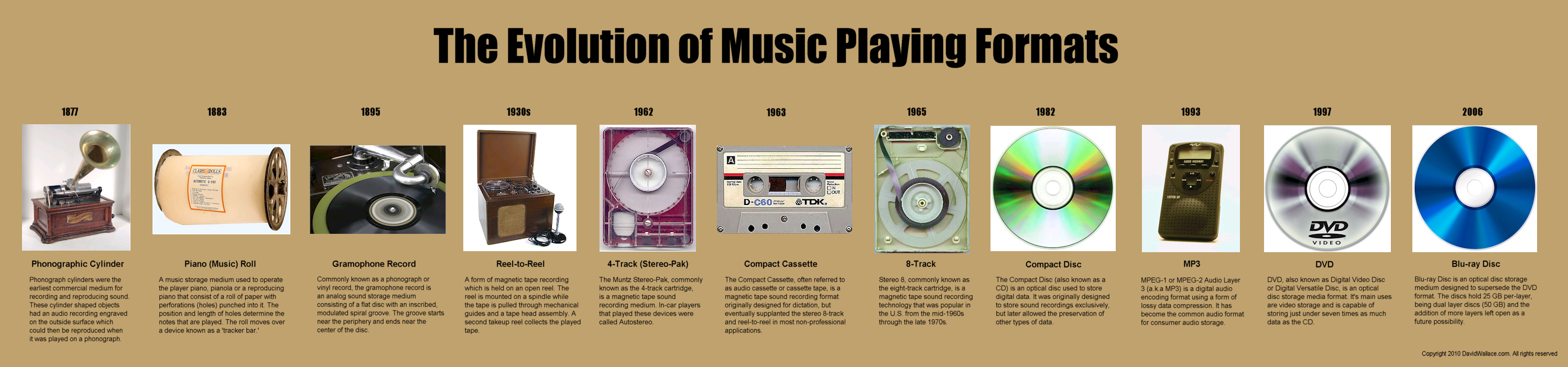
Evolution of Music Player Formats
History of Portable Music Players
History Of Music Players
Music player imagery
Timeline Inspiration
More Imagery
Evolution of Music Player Formats
History of Portable Music Players
Wednesday, November 14, 2012
Unit 6 Reading
Thematic maps are created to compare geographical information. These kinds of maps can be used for many different kinds of information that generally use symbols or colors so that the audience is able to easily attain important information. The amount of detail is completely up to the designer, and there are generally no limitations when it comes to the creation of thematic maps. The importance of these designs is so one can easily find what they are looking for, a country, state, town, or geographical monument.
Design Principles for Map Design
Tools for Mapping
Scatter plots are created so that people are able to visualize trends, or be able to point out data that may abnormal. Scatter plots are very useful when looking to visualize a lot of data without having to use tables. When making observations upon looking at scatter plots, our brain is able to easily identify these trends or outliers.
Pros and Cons of Scatter plots
Interesting scatter plot
Tuesday, November 6, 2012
Unit 5 Reading
This week we strayed away from our textbook and read some very interesting articles online about information design. From the three articles, I feel like the most informative and helpful would be from Smashing Magazine, The Do's and Dont's of Infographic design. I was able to take a lot of great information out of this article and I realized things that will help me with my own infographic. Something that was very important to me specifically was the point they made on "Show don't tell." Infographics aren't meant for reading, they are meant for a quick understanding of an abundance of information. This made me understand the concept of infographics. What was also helpful was the importance of a color scheme. Using three primary colors, and not using white is very important when reading key elements of any infographic.
I wanted to expand on this "Do's and Dont's" concept, so here is a second opinion on the important aspects of infographics
A quick guide to Infographic Marketing
I love this one, Evil Effects of Bad infographics
I wanted to expand on this "Do's and Dont's" concept, so here is a second opinion on the important aspects of infographics
A quick guide to Infographic Marketing
I love this one, Evil Effects of Bad infographics
Subscribe to:
Posts (Atom)