Wednesday, October 31, 2012


Tuesday, October 30, 2012
Information for EDM Infographic
Title: EDM
Sub Title: Electronic Dance Music
Genres: House, Trance, Techno, and Dubstep
BPM: (125 BPM) (130 BPM) (127 BPM) (140 BPM)
Statistics:
Rate of Popularity
Genre Popularity
Total Popularity Since 2004
Between January 2004 and June 2012, Engaged and Interested Listens and Plays (EILPs) of EDM rose from approximately 234 million to 842 million, a 260% increase.
In 2010, 2011 and the first half of 2012, more people listened to EDM than in the previous six years combined.
In 2004, nearly 90% of commercial radio stations played no EDM whatsoever. In 2012, only 24.5% omitted EDM completely.
I would also love to compare two United States festivals at the bottom of my data heavy information graphic
Electric Daisy Carnival
Originated: 1997
Founder: Insomniac Events
Location: Las Vegas
2012 Attendees: 230,000
Month: June
Attire: Costumes, Tutu's, "Kandi," etc.
Ultra Music Festival:
Originated: 1999
Founder: Russell Faibisch and Alex Omes
Location: Miami, Florida
2012 Attendees: 165,000 people
Month: March
Attire: Casual
Unit 4 Reading
Chapter two was all about the process behind a design; discovering the story each project has to tell. Designers are trained to do this type of research. Understanding who your client is, their message they are trying to tell, and their target audience is crucial to any successful design. A great way to begin any project is to create a timeline. This will ensure you and your team understands deadlines and what your client expects out of you in a period of time. Knowing your audience and the content you are creating for is a huge part of the planning process. Some helpful ways in better understanding your demographic is to create personas. These will define who your audience is, and what they expect to gain from your brand or design. Another key aspect in the design process is a creative brief. This will help organize your information in one place. Creative briefs can be very helpful for people you may be working with so that everyone has a clear understanding of the project's background, and where the project may be headed.
The Do's and Dont's of a Creative Brief
Web Designer's Depot
User Persona Wireframe
The Do's and Dont's of a Creative Brief
Web Designer's Depot
User Persona Wireframe
Monday, October 29, 2012


Wednesday, October 24, 2012
Tuesday, October 23, 2012
P2 Project Statement
Data Visualization
Background:
There has always been a dispute about the two festivals, Electric Daisy Carnival, and Ultra Music Festival. Both of these festivals are located in the United States, but are on opposite sides of the country. The scenes are complete opposites, and can be described as the east and west coast rave scenes. This info graphic will show the different statistics that will include attendees, Facebook fans, profit, time of month, when the festivals began, where they are located, and what the festivals include.
Target Audiences:
The target audience for this will be between the ages 16 and 35. Both male and female festival lovers who enjoy dancing, and electronic music.
Obstacles:
Obstacles may be demonstrating the differences of these festivals without having a personal bias towards one or the other.
Support Statements:
This poster will be able to show each festival's strengths, while being compared to one another. That way, facts will determine which festival is "better" than the other, rather than based on emotional attachment.
Tone:
Informative
Media:
Poster, or online infographic
Creative Considerations:
Something to consider is finding a way to mesh both styles of festival into one poster. Using different color schemes to define each festival will be important.
Project 2 Ideas and Inspiration
I have been having trouble with this assignment, but I feel like it would be the perfect time to incorporate my love of music. Thoughts have been running through my head, and automatically I thought of the website, beatport.com. This website is a place where people can buy, listen, and see the most recent electronic music being released to the public. Beatport also has a section that indicates the top 10 mixes of each genre. Something that really made me think this could be my inspiration for an infographic was the way they include the "bpm" or beats per minute at the top while playing each song. This bpm is an indicator of each genre. For example, 130 BPM would define house music, while 180 BPM would be drum and bass.
Something else I thought of, which is kind of odd, is King Corn. Some coworkers were talking to be about this documentary and the information was very interesting to me. For that project, I would need to watch the documentary to get more information on the subject.
Another idea I had came from my love of owls. There's just something about them that fascinate me, maybe the fact they are so mysterious and nocturnal. I also got inspiration from an image of vector owls. I would love to create graphic owls for this assignment. I found a lot of information on this topic here. I was thinking I could create an infographic based on the owls of washington. Describing their eating habits, nests, reproduction, and longevity. I could also create an infographic describing the different aesthetics that make up each owl species.
I was also thinking about creating an infographic on the health benefits of laughing.
Something that I would love to do, is create an infographic on the evolution of music. I would love to make this very graphic heavy, like this image:
Unit 3 Reading
This chapter covered many different information graphic case studies. What was interesting about all of these was how diverse the information was from each graphic. These types of graphics are created to draw relationships between information in order for the audience to draw their own conclusions. Information design requires a lot of research from the designer, because in designing these you must have knowledge on the subject in order to create make information clear to other people. Something also important is as a designer you must have passion for the subject.
"I always have to figure out which bits are better said in pictures and which are better said in words. And then I have to think about how to do both concisely." -Nigel Holmes.
Here are some more information graphic case studies
Found a place that shows some inspiring information grahpics
Five steps to creating a powerful infographic
A site that defines 5 different types of infographics
Thursday, October 18, 2012
Rusko Portfolio PDF
This morning I woke up to a Facebook notification from a friend, telling me I should send in my portfolio to the Rusko management. I decided to do so, and I have included the portfolio I sent them. I'm a little nervous, because this is my first time showing anyone professional my portfolio!
Tuesday, October 16, 2012
Unit 2 Reading
Chapter four was very engaging and made me realize the many different ways of drawing in the viewers attention. The chapter explains how successful designers have used color, type, scale, rhythm, sounds, and motion in order to create beautiful design solutions. One of my favorite ways of drawing in the viewers attention is through weight and scale. I love adding this affect to my designs in order to create dramatic hierarchy. Something I also love as a viewer, is the use of graphic elements. Combining graphic elements with the important content makes gives the information a purpose. The graphic elements help to add meaning to something by a representational image.
One quote I really enjoyed in this chapter,
"Graphic design is a form of translation."
That is our job as graphic designers, to increase legibility in the most beautiful fashion.
I found this really interesting link that allows you to edit each individual element to the way you would want to use it for your own purposes! How cool
http://www.behance.net/gallery/Infographic-elements-Visual-Information-design/1043117
This website explains the importance of color, and what different colors mean to people
http://www.vanseodesign.com/web-design/color-meaning/
I found another site that allows you to download the vector infographic information. I would never suggest any designer to do this, but it may spark some creativity.. or you may be able to find a basic element you could use in them
http://www.designfreebies.org/free-vectors/8-free-infographic-vector-design-elements/
I found this website interesting, if you want to see the different types of infographics most commonly created, check it out.
http://blog.marketo.com/blog/2011/09/infographic-art-the-types-and-trends-marketers-must-know.html
Tuesday, October 9, 2012
Adventure Club Sitemap
First rendition on the site map I will be using to create my first website. Adventure Club!

Unit 1 Reading
Chapter 1 from, Information Design Workbook arose some very interesting information I have not covered yet. Some things that really interested me was how information design is incorporated in the courtroom. Litigation graphics is something I have never even heard of before. This type of design requires a graphic artist that fully understands how to communicate images effectively while telling a story in only a few seconds. In litigation communication, Airan Wright (a designer and consultant at Zagnoli McEvoy Foley LLC) explains the importance of presenting each point clearly. "Choosing the right medium makes a big difference," (Baer 27). Not only is presenting information clearly important in court, way finding systems, websites, application forms, user guidelines, and many more require a keen sense to usability. I want to explore this further and find some examples of good vs. bad information design.
I found an article that shows a few more examples, but here are the two that really stuck out to me:
BAD


I found an article that shows a few more examples, but here are the two that really stuck out to me:
BAD

Good!
I am pretty sure we can all understand why the first image is a bad one. When I looked at it the first time I couldn't figure out what to examine first. My eyes went around the page like a border, scanning information but nothing really interested me. A typical user would look at the first image and most likely pass it by without giving it any notice.
The second is an awesome example that really drives a person to read through the entire thing. The color choices make the obvious connection to the United States that will attract almost any American's attention. Even will the abundance of information, this infographic is very easy and even fun to read. The dynamic way the illustrations move you throughout the page is almost like a maze. You almost forget you are reading a bias of information.
More examples of good vs. bad can be found here!
Now, let's go back to what we were first discussing: Litigation design. I really want to add some examples of these because I think they are so fascinating, and definitely something I would have never expected as a job of a graphic designer.
Here is a website where you can observe a Litigation Graphics portfolio
After looking more into Litigation Graphics, I definitely know this is not the direction I see myself going! But, still very interesting to explore.
Monday, October 8, 2012
P1: Competitive Analysis


I just love what this person did with this physical infographic. I am hoping to do something similar but not incorporate a circle or celebrities
P1: Project Statement
Physical Infographic Project Statement
- Background: For this project my client will be Sunglass Hut, the leading authority on premium sun-wear. This infographic will be used on their website in order to provide an interactive and fun way for their customers to find the right style of sunglasses to fit their different personalities and face shapes. Sunglass Hut already provides this type of service, but does not combine the face shape with a person's personality. The infographic will be displayed either on their homepage or underneath their "Style" link on the navigation bar.
- Target Audiences: Both male and female is the audience with a range from early twenties to late thirties who look are interested in high-fashion and performance sunglasses.
- Objectives: To create an entertaining infographic for customers to use while shopping for sunglasses. This will eliminate time and will allow customers to see all of their custom shapes in one place.
- Obstacles: Being able to fit every shape in this infographic may be difficult with the little space the web provides. Legibility and space could cause some troubles.
- Key Benefit: This infographic will be both easy to use and a fast way to shop online. Giving the customer what they want, where they want it will help them have a successful shopping experience.
- Support Statements: With this infographic, Sunglass Hut will be provided with something that could eliminate clutter and extra links on their website. With this they will have what they need all in one place, rather than navigating through both "face shape" and "styles."
- Tone: Fresh, fun, and interactive.
- Media: Web
- Creative Considerations: Be thinking about the space you have and the dimensions intended to use on the web. Consider whether or not this can be mobile compatible, and if so, will this be scrollable rather than on an image that is only horizontal.
Other Ideas for Physical Infographic
To add onto my first and prime idea for Sunglass hut, I was also thinking about creating a physical info graphic for my other passion, EDM (Electronic Dance Music).
Since I plan to work in the music industry after graduation, incorporating these types of projects in my portfolio is always on my mind. So, a couple ideas I had were to create an infographic talking about where the different EDM genres originated, and where the top DJ's of the world came from.
The first idea I would include the sub-genres of: Dubstep, House, Trance, and Techno
The second idea I had would be to show a world map and have dots indicating the top DJ's from around the world. When someone would hover over these dots, the DJ's name/picture would pop up with information about them and where they could find a sample song.
These ideas would be fun to execute, but I feel like the Sunglasshut project seems more realistic for this project. The reason I think this is because I already have a client, a projected source of information, and a wireframe ready to go! I guess I will save these ideas for another time.
Thursday, October 4, 2012
Project 1: Physical Infographic
For this project I came up with three ideas and am having trouble deciding which one to choose from.
I am very interested in creating things that involve motion, so I would love to make these infographics interactive using the roll-over technique.
My first idea was to create a physical infographic for Sunglass Hut. This infographic would show the different styles of sunglasses (or choose a few because the list is quite long) they carry with information explaining what kind of person or what type of personality would fit that frame.
-or- Rather than saying which kind of personality fits the frame, rather what each frame represents
For example: If I were to rollover the butterfly shade, I would get a description that would include the words "bold & high fashion."
All of the descriptions I have pulled directly from their website. You can view that here.
As for the destination of this physical infographic, I would want the image to be on their style page, or even featured as their home page. This could give Sunglass Hut a fun touch of interactivity on their website that I feel clients would enjoy. Rather than clicking on the style link and being directed to a place that displays names rather than frames, they are able to see the shapes of the sunglasses independently.
I should be able to create this myself using indesign which can be exported as a flash file. If this file does not work properly online, then a developer may be necessary. Each of my layers will be established properly. Each roll-over will have it's separate layer in order to provide clear communication.
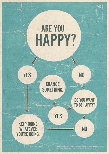
Below is an example flow chart of what I want to show with this infographic.

I am very interested in creating things that involve motion, so I would love to make these infographics interactive using the roll-over technique.
My first idea was to create a physical infographic for Sunglass Hut. This infographic would show the different styles of sunglasses (or choose a few because the list is quite long) they carry with information explaining what kind of person or what type of personality would fit that frame.
-or- Rather than saying which kind of personality fits the frame, rather what each frame represents
For example: If I were to rollover the butterfly shade, I would get a description that would include the words "bold & high fashion."
All of the descriptions I have pulled directly from their website. You can view that here.
As for the destination of this physical infographic, I would want the image to be on their style page, or even featured as their home page. This could give Sunglass Hut a fun touch of interactivity on their website that I feel clients would enjoy. Rather than clicking on the style link and being directed to a place that displays names rather than frames, they are able to see the shapes of the sunglasses independently.
I should be able to create this myself using indesign which can be exported as a flash file. If this file does not work properly online, then a developer may be necessary. Each of my layers will be established properly. Each roll-over will have it's separate layer in order to provide clear communication.
Below is an example flow chart of what I want to show with this infographic.


Wednesday, October 3, 2012
Subscribe to:
Posts (Atom)