What I took out of the Relation Circle patterns, is a way of laying out a network of information that correlates with each other in a circular aspect. Each piece of information is equally spaced around the circle and gives a clear indication of the relationship each part has with one another. Something that may help in the creation of this type of graph is to categorize your information by color coding different portions.
Videos on Visualizing Relationships
Weather Chart visualization
Bubble charts look very similar to scatter plots, but are created in a way that enables the designer to use more information. Bubble charts help the user understand differences and similarities by using data that is placed upon an x and y axis. When developing these graphs, the bubbles can be manipulated through size, color, or contrast so that the user is able to group specific information and understand things quickly.
Google Developer Bubble Chart
Interesting ways of creating bubble charts
Monday, November 26, 2012
Wednesday, November 21, 2012
P3 Project Statement
Background:
With the increase of knowledge of technology, our music devices are continually becoming more advanced. In 2013, Neil Young will be releasing his high resolution music device, Pono. Pono is the next generation of music players that will play songs with the same studio quality as they were created. As an advertising opportunity, and an introduction to the website a timeline will show music players dated back to the phonograph and will end with the Pono device.
Target Audiences:
The demographic will be music listeners who are more interested in hearing the music for the beauty of the songs sound engineering rather than just simply listening. They are people who may currently use Ipods. The age will range between 15 and 60.
Obstacles:
An obstacle that I may encounter is the lack of current information that has been released about this music player. Finding accurate information may be difficult, since this device is still kept behind doors.
Support Statements:
This will be a representation of where the future lies. Viewers will be able to see the next best thing in music. This will also be a way to release this device, in an interactive way.
Tone:
Historical, futuristic.
Media:
This will be released on the Pono website, and will be an introduction to the device.
Creative Considerations:
This will be a fun piece, and will enable me to give this product an entire style guide.
Tuesday, November 20, 2012
Unit 7 Reading
This week, we explored different information design mediums. After reading this chapter, I am able to identify each field of information graphic design. Interactivity is essential for our generation, with the increase of technology, interactivity is becoming a second nature to us. That is why reading this chapter is so important. Whether you are a graphic designer, web designer, or even an industrial designer, user interface is key to the success of any design. Having a good understanding of information architecture will be helpful for an interactive designer. Especially those specializing in web design. The navigation of websites will either make or break a site, so knowing logistics behind this important aspect of a website will allow the designer to create a successful user interface.
Ways to engage Interactive Infographics
Good Infographics
Ways to engage Interactive Infographics
Good Infographics
Friday, November 16, 2012
Project 3 Ideas
Finally, I believe I came to a conclusion of what I will create for our final project. I want to make a music player timeline, that I will illustrate rather than use photographs of music players over the years. This may be an ad for Apple if possible, because the final player will be an Ipod. The only creative consideration I may have to face is their advertisement style guides.
History Of Music Players
Music player imagery
Timeline Inspiration
More Imagery
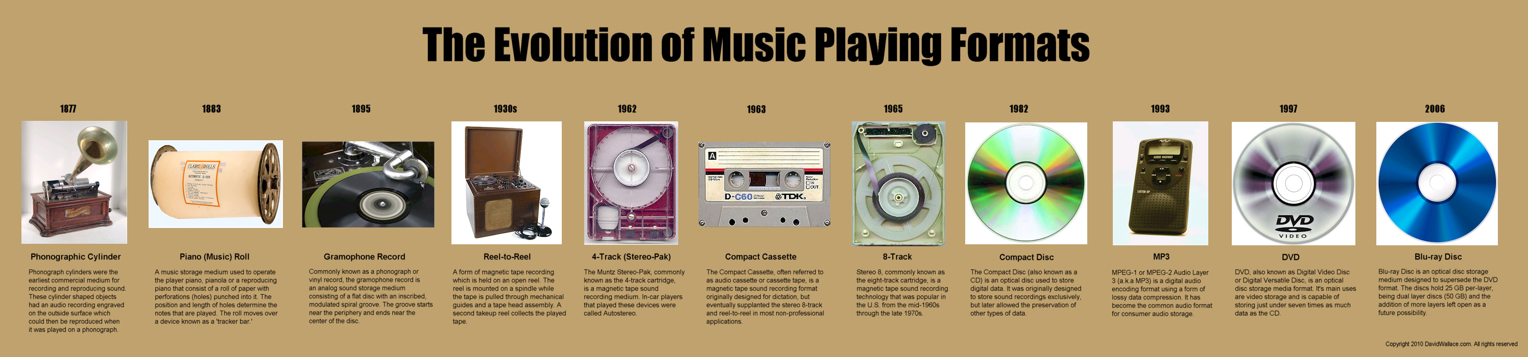
Evolution of Music Player Formats
History of Portable Music Players
History Of Music Players
Music player imagery
Timeline Inspiration
More Imagery
Evolution of Music Player Formats
History of Portable Music Players
Wednesday, November 14, 2012
Unit 6 Reading
Thematic maps are created to compare geographical information. These kinds of maps can be used for many different kinds of information that generally use symbols or colors so that the audience is able to easily attain important information. The amount of detail is completely up to the designer, and there are generally no limitations when it comes to the creation of thematic maps. The importance of these designs is so one can easily find what they are looking for, a country, state, town, or geographical monument.
Design Principles for Map Design
Tools for Mapping
Scatter plots are created so that people are able to visualize trends, or be able to point out data that may abnormal. Scatter plots are very useful when looking to visualize a lot of data without having to use tables. When making observations upon looking at scatter plots, our brain is able to easily identify these trends or outliers.
Pros and Cons of Scatter plots
Interesting scatter plot
Tuesday, November 6, 2012
Unit 5 Reading
This week we strayed away from our textbook and read some very interesting articles online about information design. From the three articles, I feel like the most informative and helpful would be from Smashing Magazine, The Do's and Dont's of Infographic design. I was able to take a lot of great information out of this article and I realized things that will help me with my own infographic. Something that was very important to me specifically was the point they made on "Show don't tell." Infographics aren't meant for reading, they are meant for a quick understanding of an abundance of information. This made me understand the concept of infographics. What was also helpful was the importance of a color scheme. Using three primary colors, and not using white is very important when reading key elements of any infographic.
I wanted to expand on this "Do's and Dont's" concept, so here is a second opinion on the important aspects of infographics
A quick guide to Infographic Marketing
I love this one, Evil Effects of Bad infographics
I wanted to expand on this "Do's and Dont's" concept, so here is a second opinion on the important aspects of infographics
A quick guide to Infographic Marketing
I love this one, Evil Effects of Bad infographics
Wednesday, October 31, 2012


Tuesday, October 30, 2012
Information for EDM Infographic
Title: EDM
Sub Title: Electronic Dance Music
Genres: House, Trance, Techno, and Dubstep
BPM: (125 BPM) (130 BPM) (127 BPM) (140 BPM)
Statistics:
Rate of Popularity
Genre Popularity
Total Popularity Since 2004
Between January 2004 and June 2012, Engaged and Interested Listens and Plays (EILPs) of EDM rose from approximately 234 million to 842 million, a 260% increase.
In 2010, 2011 and the first half of 2012, more people listened to EDM than in the previous six years combined.
In 2004, nearly 90% of commercial radio stations played no EDM whatsoever. In 2012, only 24.5% omitted EDM completely.
I would also love to compare two United States festivals at the bottom of my data heavy information graphic
Electric Daisy Carnival
Originated: 1997
Founder: Insomniac Events
Location: Las Vegas
2012 Attendees: 230,000
Month: June
Attire: Costumes, Tutu's, "Kandi," etc.
Ultra Music Festival:
Originated: 1999
Founder: Russell Faibisch and Alex Omes
Location: Miami, Florida
2012 Attendees: 165,000 people
Month: March
Attire: Casual
Unit 4 Reading
Chapter two was all about the process behind a design; discovering the story each project has to tell. Designers are trained to do this type of research. Understanding who your client is, their message they are trying to tell, and their target audience is crucial to any successful design. A great way to begin any project is to create a timeline. This will ensure you and your team understands deadlines and what your client expects out of you in a period of time. Knowing your audience and the content you are creating for is a huge part of the planning process. Some helpful ways in better understanding your demographic is to create personas. These will define who your audience is, and what they expect to gain from your brand or design. Another key aspect in the design process is a creative brief. This will help organize your information in one place. Creative briefs can be very helpful for people you may be working with so that everyone has a clear understanding of the project's background, and where the project may be headed.
The Do's and Dont's of a Creative Brief
Web Designer's Depot
User Persona Wireframe
The Do's and Dont's of a Creative Brief
Web Designer's Depot
User Persona Wireframe
Monday, October 29, 2012


Wednesday, October 24, 2012
Tuesday, October 23, 2012
P2 Project Statement
Data Visualization
Background:
There has always been a dispute about the two festivals, Electric Daisy Carnival, and Ultra Music Festival. Both of these festivals are located in the United States, but are on opposite sides of the country. The scenes are complete opposites, and can be described as the east and west coast rave scenes. This info graphic will show the different statistics that will include attendees, Facebook fans, profit, time of month, when the festivals began, where they are located, and what the festivals include.
Target Audiences:
The target audience for this will be between the ages 16 and 35. Both male and female festival lovers who enjoy dancing, and electronic music.
Obstacles:
Obstacles may be demonstrating the differences of these festivals without having a personal bias towards one or the other.
Support Statements:
This poster will be able to show each festival's strengths, while being compared to one another. That way, facts will determine which festival is "better" than the other, rather than based on emotional attachment.
Tone:
Informative
Media:
Poster, or online infographic
Creative Considerations:
Something to consider is finding a way to mesh both styles of festival into one poster. Using different color schemes to define each festival will be important.
Project 2 Ideas and Inspiration
I have been having trouble with this assignment, but I feel like it would be the perfect time to incorporate my love of music. Thoughts have been running through my head, and automatically I thought of the website, beatport.com. This website is a place where people can buy, listen, and see the most recent electronic music being released to the public. Beatport also has a section that indicates the top 10 mixes of each genre. Something that really made me think this could be my inspiration for an infographic was the way they include the "bpm" or beats per minute at the top while playing each song. This bpm is an indicator of each genre. For example, 130 BPM would define house music, while 180 BPM would be drum and bass.
Something else I thought of, which is kind of odd, is King Corn. Some coworkers were talking to be about this documentary and the information was very interesting to me. For that project, I would need to watch the documentary to get more information on the subject.
Another idea I had came from my love of owls. There's just something about them that fascinate me, maybe the fact they are so mysterious and nocturnal. I also got inspiration from an image of vector owls. I would love to create graphic owls for this assignment. I found a lot of information on this topic here. I was thinking I could create an infographic based on the owls of washington. Describing their eating habits, nests, reproduction, and longevity. I could also create an infographic describing the different aesthetics that make up each owl species.
I was also thinking about creating an infographic on the health benefits of laughing.
Something that I would love to do, is create an infographic on the evolution of music. I would love to make this very graphic heavy, like this image:
Unit 3 Reading
This chapter covered many different information graphic case studies. What was interesting about all of these was how diverse the information was from each graphic. These types of graphics are created to draw relationships between information in order for the audience to draw their own conclusions. Information design requires a lot of research from the designer, because in designing these you must have knowledge on the subject in order to create make information clear to other people. Something also important is as a designer you must have passion for the subject.
"I always have to figure out which bits are better said in pictures and which are better said in words. And then I have to think about how to do both concisely." -Nigel Holmes.
Here are some more information graphic case studies
Found a place that shows some inspiring information grahpics
Five steps to creating a powerful infographic
A site that defines 5 different types of infographics
Thursday, October 18, 2012
Rusko Portfolio PDF
This morning I woke up to a Facebook notification from a friend, telling me I should send in my portfolio to the Rusko management. I decided to do so, and I have included the portfolio I sent them. I'm a little nervous, because this is my first time showing anyone professional my portfolio!
Tuesday, October 16, 2012
Unit 2 Reading
Chapter four was very engaging and made me realize the many different ways of drawing in the viewers attention. The chapter explains how successful designers have used color, type, scale, rhythm, sounds, and motion in order to create beautiful design solutions. One of my favorite ways of drawing in the viewers attention is through weight and scale. I love adding this affect to my designs in order to create dramatic hierarchy. Something I also love as a viewer, is the use of graphic elements. Combining graphic elements with the important content makes gives the information a purpose. The graphic elements help to add meaning to something by a representational image.
One quote I really enjoyed in this chapter,
"Graphic design is a form of translation."
That is our job as graphic designers, to increase legibility in the most beautiful fashion.
I found this really interesting link that allows you to edit each individual element to the way you would want to use it for your own purposes! How cool
http://www.behance.net/gallery/Infographic-elements-Visual-Information-design/1043117
This website explains the importance of color, and what different colors mean to people
http://www.vanseodesign.com/web-design/color-meaning/
I found another site that allows you to download the vector infographic information. I would never suggest any designer to do this, but it may spark some creativity.. or you may be able to find a basic element you could use in them
http://www.designfreebies.org/free-vectors/8-free-infographic-vector-design-elements/
I found this website interesting, if you want to see the different types of infographics most commonly created, check it out.
http://blog.marketo.com/blog/2011/09/infographic-art-the-types-and-trends-marketers-must-know.html
Tuesday, October 9, 2012
Adventure Club Sitemap
First rendition on the site map I will be using to create my first website. Adventure Club!

Unit 1 Reading
Chapter 1 from, Information Design Workbook arose some very interesting information I have not covered yet. Some things that really interested me was how information design is incorporated in the courtroom. Litigation graphics is something I have never even heard of before. This type of design requires a graphic artist that fully understands how to communicate images effectively while telling a story in only a few seconds. In litigation communication, Airan Wright (a designer and consultant at Zagnoli McEvoy Foley LLC) explains the importance of presenting each point clearly. "Choosing the right medium makes a big difference," (Baer 27). Not only is presenting information clearly important in court, way finding systems, websites, application forms, user guidelines, and many more require a keen sense to usability. I want to explore this further and find some examples of good vs. bad information design.
I found an article that shows a few more examples, but here are the two that really stuck out to me:
BAD


I found an article that shows a few more examples, but here are the two that really stuck out to me:
BAD

Good!
I am pretty sure we can all understand why the first image is a bad one. When I looked at it the first time I couldn't figure out what to examine first. My eyes went around the page like a border, scanning information but nothing really interested me. A typical user would look at the first image and most likely pass it by without giving it any notice.
The second is an awesome example that really drives a person to read through the entire thing. The color choices make the obvious connection to the United States that will attract almost any American's attention. Even will the abundance of information, this infographic is very easy and even fun to read. The dynamic way the illustrations move you throughout the page is almost like a maze. You almost forget you are reading a bias of information.
More examples of good vs. bad can be found here!
Now, let's go back to what we were first discussing: Litigation design. I really want to add some examples of these because I think they are so fascinating, and definitely something I would have never expected as a job of a graphic designer.
Here is a website where you can observe a Litigation Graphics portfolio
After looking more into Litigation Graphics, I definitely know this is not the direction I see myself going! But, still very interesting to explore.
Monday, October 8, 2012
P1: Competitive Analysis


I just love what this person did with this physical infographic. I am hoping to do something similar but not incorporate a circle or celebrities
P1: Project Statement
Physical Infographic Project Statement
- Background: For this project my client will be Sunglass Hut, the leading authority on premium sun-wear. This infographic will be used on their website in order to provide an interactive and fun way for their customers to find the right style of sunglasses to fit their different personalities and face shapes. Sunglass Hut already provides this type of service, but does not combine the face shape with a person's personality. The infographic will be displayed either on their homepage or underneath their "Style" link on the navigation bar.
- Target Audiences: Both male and female is the audience with a range from early twenties to late thirties who look are interested in high-fashion and performance sunglasses.
- Objectives: To create an entertaining infographic for customers to use while shopping for sunglasses. This will eliminate time and will allow customers to see all of their custom shapes in one place.
- Obstacles: Being able to fit every shape in this infographic may be difficult with the little space the web provides. Legibility and space could cause some troubles.
- Key Benefit: This infographic will be both easy to use and a fast way to shop online. Giving the customer what they want, where they want it will help them have a successful shopping experience.
- Support Statements: With this infographic, Sunglass Hut will be provided with something that could eliminate clutter and extra links on their website. With this they will have what they need all in one place, rather than navigating through both "face shape" and "styles."
- Tone: Fresh, fun, and interactive.
- Media: Web
- Creative Considerations: Be thinking about the space you have and the dimensions intended to use on the web. Consider whether or not this can be mobile compatible, and if so, will this be scrollable rather than on an image that is only horizontal.
Other Ideas for Physical Infographic
To add onto my first and prime idea for Sunglass hut, I was also thinking about creating a physical info graphic for my other passion, EDM (Electronic Dance Music).
Since I plan to work in the music industry after graduation, incorporating these types of projects in my portfolio is always on my mind. So, a couple ideas I had were to create an infographic talking about where the different EDM genres originated, and where the top DJ's of the world came from.
The first idea I would include the sub-genres of: Dubstep, House, Trance, and Techno
The second idea I had would be to show a world map and have dots indicating the top DJ's from around the world. When someone would hover over these dots, the DJ's name/picture would pop up with information about them and where they could find a sample song.
These ideas would be fun to execute, but I feel like the Sunglasshut project seems more realistic for this project. The reason I think this is because I already have a client, a projected source of information, and a wireframe ready to go! I guess I will save these ideas for another time.
Thursday, October 4, 2012
Project 1: Physical Infographic
For this project I came up with three ideas and am having trouble deciding which one to choose from.
I am very interested in creating things that involve motion, so I would love to make these infographics interactive using the roll-over technique.
My first idea was to create a physical infographic for Sunglass Hut. This infographic would show the different styles of sunglasses (or choose a few because the list is quite long) they carry with information explaining what kind of person or what type of personality would fit that frame.
-or- Rather than saying which kind of personality fits the frame, rather what each frame represents
For example: If I were to rollover the butterfly shade, I would get a description that would include the words "bold & high fashion."
All of the descriptions I have pulled directly from their website. You can view that here.
As for the destination of this physical infographic, I would want the image to be on their style page, or even featured as their home page. This could give Sunglass Hut a fun touch of interactivity on their website that I feel clients would enjoy. Rather than clicking on the style link and being directed to a place that displays names rather than frames, they are able to see the shapes of the sunglasses independently.
I should be able to create this myself using indesign which can be exported as a flash file. If this file does not work properly online, then a developer may be necessary. Each of my layers will be established properly. Each roll-over will have it's separate layer in order to provide clear communication.
Below is an example flow chart of what I want to show with this infographic.


Wednesday, October 3, 2012
Wednesday, June 13, 2012
Monday, June 4, 2012
Wednesday, May 23, 2012
The Ram App
Application Definition Statement
Purpose:
The Ram iPhone and iPad app focuses on the satisfaction of our guests. We created this in order to provide immediate access to our menu, ordering food, and allowing them to view our waiting list prior to their arrival. This app is designed for people who love to get in and get out, who are in a hurry, or enjoy ordering before they arrive.
1.Features Users Might Like:
- Easy access to the menu
- Ordering food prior to arrival
- Immediate credit card payment
- No waitress
- Being able to view the waiting list
- Knowing when their food is ready
- Who Are The Users:
People who are using iPhone, iPod Touch, and iPad.
- UW Students
- Business people in a hurry
- Large parties looking for tables
- Families
- Shoppers at the Village
- Regular guests
- Love to get in get out, often in a hurry, and enjoy ordering before they arrive.
- Filter the Feature List:
- Register or Login – go to locations
- - When the app opens, there will be a loading screen showing the Ram logo. Next there will be a screen that asks the user to login, whether they want to login using facebook, or create their own account through the Ram application. These accounts will store their information, from their name to their credit card number (for easy access in the future)
- - Once they login there will be a window that will ask for their current location, which will locate the closest Ram restaurant in their area on google maps.
- Viewing the menu
- - The menu will differ between each location, and will have pricing and an option to view the happy hour menu.
- Finding a table for dine in – check waiting list
- - The option for finding a table will show the current waiting list, whether there is one or not. If there is no waiting list, there will be an image that will show the tables that are currently available, and how many.
- Placing an order
- - Placing an order will be included in the menu button. While they are viewing the menu they have access to click each item, add a quantity number, and that will be added to their order. Each item they click will be represented by a check mark which indicates that is the item they have chosen.
- Payment
- - The payment window will have a summary of their chosen items, they will have an option to confirm their order, or go back and add/subtract items. This window will show them their total, with tax added, with an option to add a tip. After they confirm their order they will be brought to a screen that will allow them to enter their credit card number. Once their order is completed they will be shown their receipt, with the option to print/email (if necessary).
Competitors:
Open Table
Urban Spoon
Yelp
This website is impressive
A website by friends at UW. Incredible work! Well done.
http://www.uwdesign2012.com/
http://www.uwdesign2012.com/
Wednesday, May 16, 2012
Mobile App Ideas
Electric Daisy Carnival: Update, and create one for 2012
Dream board: Created for the use of the law of attraction
Beach App: Finding locations, what should you bring, weather
Restaurant App: This application would allow you to order food without the use of a waitress. With your phone you can look at the menu, and instantly your order would be sent to the kitchen. This app also allows you to pay for you meal
Thursday, May 10, 2012
Wall of Sound Logo design
After a few days of working, I finally came up an appropriate logo for the "hipster" type of record store located in Seattle, Wall of Sound.


Type and Letterform Design

During my Type and Letterform class we were asked to recreate a product logo. For mine, I wanted to redesign a product by Sally Hansen. This is a lip product, (which might I add is one of their only other cosmetic product) is something that I have seen in stores. Of course, I hated the design. The logo disappointed me, and definitely did not represent "feminine." Rather than present them with a logo that could be typed on a computer, I wanted to give them a design they could call their own. Below is the original product.

And here is my redesign! (:

Wednesday, May 9, 2012
Week 6
During these two chapters, the main focus was really on giving the user what they are looking for, and understanding how important it is to make sure your webpage is accessible. You want to give your user what they are looking for! There is no question about this. Your user is visiting your site for a reason, so provide them with what they want, and need. Something important to remember is to provide them with the information they want, and do not hide any details you may want to. This includes prices and what not. Your user wants to find things upfront, so make it easier for them. You are the designer. The next chapter talked about accessibility. This is important because not everyone is the same. There are many different disabilities out there, and there are plenty of web users of that sort. You can't neglect any user, so keep that in mind! Remembering accessibility is the right thing to do. In the book there was a link he recommended we read, http://redish.net/content/papers/interactions.html.
Some key points he made in chapter 11 were:
Some key points he made in chapter 11 were:
1.
fix the usability problems that confuse everyone
a.
test it often
2.
read an article
a.
blind listen with their ears
3.
read a book
a.
building accessible websites by joe clark
b.
constructing accessible websites by jim thatcher
et al
c.
maximum accessibility: making your website more
usable for everyone by john slatin and sharron rush
4.
Start using cascading style sheets
a.
CSS Zen Garden!
b.
Learn by watching someone do a markover for you
5.
Go for the low-hanging fruit
a.
Add appropriate alt text to every image
b.
Make your forms work with screen readers
c.
Create a “skip to main content” link at the beginning
of each page
d.
Make all content accessible by keyboard
e.
Don’t use javascript without a good reason
f.
Use client-side (not server-side) image maps

Wednesday, May 2, 2012
Unit 5 Reading Response
These two chapters discussed the complications that might arose between a team of web developers. During the times of creation, each team member has a different point of view, or belief on what works, and what doesn't. What we all need to understand is that no user is the same. Each user is unique. What the web site creators need to understand is what is important, "does our website create a good experience?" Also ask yourself, "is this easy to use?" Don't worry so much about the aesthetics. The most important things to remember when creating a website is testing. Test, test, and TEST! Testing will reveal so many things that you yourself would not have been able to recognize. Probably because of how often you've been working on this project. Bringing in someone with fresh eyes will show you things that need to be fixed and what already works well. Usability tests are necessary to see if the user understands (a) what they are doing and (b) try to complete a typical task. Testing is important, and should not be neglected. Krug says to test early and often! Testing will inform your judgement on your site throughout the entire development process!
http://www.useit.com/alertbox/9605.html
http://www.dtelepathy.com/our-work
http://ecommercegallery.com/
http://www.useit.com/alertbox/9605.html
http://www.dtelepathy.com/our-work
http://ecommercegallery.com/
Sunday, April 29, 2012
Project Statement
Wall of Sound Project Statement
- Background: Wall of Sound began in 1990, in the heart of Seattle's Belltown. Their website must have been created around that time, hence the 1990's look and feel. Their store sells a variety of music genres, from avant-garde to traditional and popular genres.
- Target Audiences: The audience that they target is someone who has a very refined taste in music. One who is interested in avant-garde japanese rock, indie, alternative, jazz, folk, experimental, electronic, electro-acoustic, and neoclassical. Their demographic seems narrow but covers a some what wide-spread interest in music choices.
- Objectives: The hope for this website redesign is to show what this local store has to offer, in order to do that there should be emphasis on the types of music they provide. Since this company has been known in Seattle for over 20 years, they should be able to be recognizable as a successful music provider. Giving them a professional look will be key, but leaving them with a distinguishable new look.
- Obstacles: Obstacles may be redesigning this website, and forgetting who this company is. We do not want to scare away their customers with a completely new look. They may not be comfortable with a completely different user interface and experience.
- Key Benefit: By redesigning their website, Wall of Sound can create a better customer experience. Redesigning their user interface will make buying online faster and easier.
- Support Statements: Currently their website is very unorganized, and leaves the user feeling uncomfortable. The redesign will increase the number of online users, and will allow them to move through the website with ease and less anxiety.
- Tone: Vintage
- Media: Web
- Creative Considerations: In order to create a successful redesign, we need to consider how the store perceives their business. This way we can create an accurate look that will represent them in the best way possible.
Wednesday, April 25, 2012
Unit 4
Chapter 7 is up for discussion this week. In the chapter, the very first thing Krug begins describing is that the homepage is "beyond our control." There are so many things that the homepage needs to cover, and in order to attract your audience. First of all, a homepage must include the sites identity and their mission. This should be the very first thing any user recognizes. Understanding that a homepage needs to cover so many things, in such little spaces draws in a problem. Understanding how to organize everything is very important when designing a homepage. You do not want to over power the user, but you want to give them what they are looking for. A search bar is a necessary tool in order to give the user a fast approach to find their specified needs. Most importantly, the user needs to know why they are at your website, and where they can find what they need. A tagline is always important to characterize your website! One of the most important parts of a homepage, or any webpage is the navigation. The navigation must be clear and easy to use. Again, there should be no questions in the brain of your user.
I really enjoy the creativity behind this websites navigation
This website uses a creative approach, but is still identifiable as a navigation system to the user.
Examples of different navigation menus
Web designer links
I really enjoy the creativity behind this websites navigation
This website uses a creative approach, but is still identifiable as a navigation system to the user.
Examples of different navigation menus
Web designer links
Wednesday, April 18, 2012
Unit 3: Breadcrumbs
Chapter six is very important to keep in mind, especially for our next big assignment. When we are designing websites, it is important to understand the importance of navigation. This chapter uses a metaphor of street signs and breadcrumbs to navigating through a website. Things should be evident in any web page. There should be a clear navigation system that can be seen, (like a LA street sign) from a far distance. We want our users to understand where they are at every moment. Confusion should not be an issue, but if this occurs there should always be an evident "home" button. The site id should always remain at the top left corner of each page so that the user always knows which site they are on. The logical hierarchy of any site should include: The site ID, sections of the site, subsections, sub-subsections, the page, areas of the page, and items on this page. Chapter 6 also describes the importance of a search bar. Often there are users that go to this first hand, rather than browsing around the entire website in order to find what they are looking for. With the search bar, there should be absolutely no confusion and should be listed as a box with a "search" button. Bottom-line, no questions asked. Another thing that was interesting to me was the use of "breadcrumbs" these help the user understand where they are, and where they have been. These are best used when they are located at the top of the page, like an accessory. To indicate movement, the best symbol would be >. The use of a small font size is key to using this as an accessory. The last thing this chapter discussed was the use of tabs as navigation. These are visual cues that the user is moving from one section, to the next and helps differentiate them from each other.
Breadcrumbs?
Breadcrumbs?
Thursday, April 12, 2012

Wednesday, April 11, 2012
Chapters 3, 4, & 5
In chapter three, the first main points covered what is most important to reveal when designing a website. These five things were: create a clear visual hierarchy on each page; take advantage of conventions; break pages up into clearly defined areas; make it obvious what's clickable; and minimize noise. Considering we are now putting together our low-fidelity webpages, these are key to keep in mind. Understanding the importance of hierarchy will help us in the future for all of our designs, whether they be print or web based. Chapter three also described how important conventions are. Conventions are important to understand where the information comes from, and why this information is of importance. They are useful for an audience because they work, and they help people navigate with ease, minimizing confusion (thought). Chapter 4 describes that websites should be clear, and precise. You should leave no questions with your user, so take out all of the unnecessary information. "Omit needless words," is very important when creating a webpage. Like the previous chapters, users scan, and don't read things that they aren't of interest. Chapter 5 tells us to get rid of everything that isn't needed, and keep all of the important things. Page 45 says that this will benefit you by reducing the noise, making useful content more prominent, and will make the page shorter. These will make both you and your user happy!

Monday, April 9, 2012
Thursday, April 5, 2012
Concept Statement: In Progress
Create a list of all users that may visit your site:
Future Clients(Employers)
Fellow students
Teachers
Friends
What will each of those users want to see in order to enjoy their visit to your site?
My design ability by viewing my portfolio
Understand the kind of designer I am and what type of work I create
Name your intended audience (the person(s) you need to persuade.)
Clients and Employers
Describe what you need to inform and persuade them of:
The reason behind creating a portfolio website is to show the beauty behind my designs, and the skills I have gained by being in school. This website will be filled with my artwork, and promote who I am, and where I want my future to take me as a designer. I hope to draw the attention of design firms, clients, and employers who would be interested in my creations. From this site I want to be able to use this as a way of connecting with people, and an easy way to show what I have to offer. Through this website, people will understand my ambition, and passion for design. I want them to see the story I tell through my creativity.
Write a 200 word concept statement based on the user, your persuasion, navigation and the assets.
For the purpose of structuring your website portfolio pages, list the categories of work you will show:
Identity
Illustration
Advertising
(hopefully motion graphics eventually)
Misc.
Identity
Illustration
Advertising
(hopefully motion graphics eventually)
Misc.
Concept Statement:
While creating my portfolio website, I want potential clients to recognize who I am as a designer without question. The first thing they will recognize is my best work, which will have hiearchy over everything else on the main page. With my website, I want all of my information to be easy to reach from the home page. I will display 7 examples of my designs which will all be available at a first glance. Each of my portfolio pieces will be available first hand, which they can enlarge to get a better understanding of what each peice represents. My logo and my name will be in the upper left hand corner where I will also have my tagline, "Be Ambitious." Not only will my future clients recognize the creativity from my work, I also want the entire webpage to have a design element that will give my audience an entire atmosphere of creativity, yet still maintaining simplicity.
I want my audience to ease through my webpage, without any difficulty. I want them to feel comfortable, and feel entertained at the same time. Simplicity is important when creating my webpage because I do not want the design of the webpage to draw away from what is important: my portfolio. My navigation will be simple, and to the point with only a few other pages which will include my resume, and contact information.

Wednesday, April 4, 2012
Unit 1 Reading Response
The beginning of this book talks all about the user interface of a website. The author Steve Krug makes an important note that, like the title, we should not make people think. The user interface of an application should be a thoughtless process where the user is able to find what they need with ease. In chapter one, Krug talks about how a person's thoughts occur while using a website. People should not have to think about what they are looking for. The more thoughts they make, the more likely the person is to get frustrated. People scan pages, rather than read them, so it is important to realize that they are usually in a hurry. Normally the viewer would feel like reading extra is unnecessary and a waste of time.
Reading these chapters made me realize that this is relevant to our day and age. These facts are true, and important to understand while creating any type of user interface design. We don't want to confuse people, and it is our job to make things simple and easy for our user. By removing all of the question marks we will have on satisfied audience, and a content designer.
Inspiring Graphic Design Portfolio Websites
 |
| http://www.triplux.com/ |
 |
| http://www.peter-pearson.com/ |
 |
| http://adaptd.com/ |
Subscribe to:
Posts (Atom)